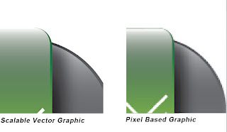
Before we start creating the button you have just seen above in Illustrator,I should point out what a vector graphic is ,just in case some people are not familiar with it.SVGs or Scalable Vector Graphics are shapes defined by paths or so called bezier curves,named after a mathematician from France.These are perfectly scalable without any loss in the effective resolution because it is not made out of a bunch of small squares or so called pixels.So one of the advantages of SVGs is scalability and smaller file size.Witch one is better then the other it is hard to tell,I use both Photoshop and Illustrator for web or print design it just depends on witch one fits my needs better for that particular project.

As we can see in the image above sv Graphics stay perfectly smooth even when you zoom in close,but we can start seeing the pixels in the other one as we zoom in.Scaling pixel based Graphics may cause fuzziness viewed on screen or pour print quality because if you scale something up you start pulling pixels away from each other and each separate dot printed on paper by the printer will be visible if the effective ppi drops under 250 pixels/inch.On huge banners a resolution of 150ppi would be ok because people wont get that close to actually see the dots.
But lets just start creating the button!
Go to File/New to create a new document. I don't want a much larger artboard then the size of the button so I went with a width of 700 points and a height of 220 points.That is a pretty large size for a web button isn't it?Well I planned my steps ahead a little and I know I will be using the grid,which will be to large for a smaller sized button in that case I would have to play around with the grid settings from the preferences dialog(cmd/ctrl+K).It is just easier for me this way.For the color mode we can choose RGB because we design this button for the web,and monitors work in RGB mode.To stay on the safe side of things i set the raster effects resolution to a resolution of 72 ppi,or a so called screen resolution but I don't think it matters anyway since we are going to save it out for web and devices and everything will get rasterized at a 72ppi resolution anyway.
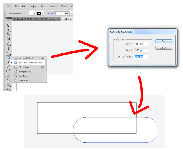
To create our button shape click and hold on the rectangle tool until all the tools nested pop up then choose the rounded rectangle. You can create a rounded rectangle by clicking and dragging on the artboard,to adjust the corner radius you will have to tap the up or down keys on your keyboard(while you are still holding down your mouse button,when you let to the rectangle gets created)An other way would be to simply click on your artboard and then a pop up window will appear where you can enter in numerically the values for the width hight and corner radius.

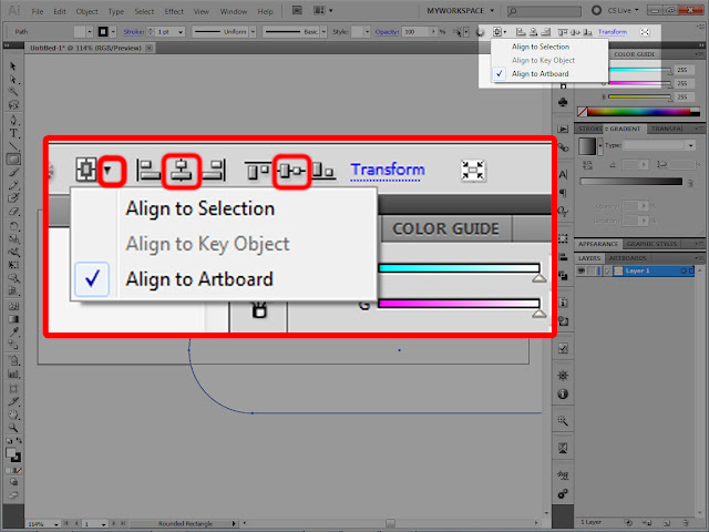
Once we have our shape we need to align it to the artboard.First make sure your object(the rounded rectangle) is still selected.Take the black arrow tool which is the top most tool in the tool bar and click on your rectangle with it.In the upper right corner(the highlighted area) we can find some alignment options.Just in case you can't find it,in some versions you will only have the word align there and you will have to click on it,or you can use the align panel.Just go to window/align and the panel will pop up.From there it is the same thing.First hit that small down pointing arrow and select align to artboard.Then hit the align centers vertically and align centers horizontally symbols and we are done.

I highlighted 3 areas of the screen because its these areas we should focus our attention in the next steps.And you can see that our object already has a gradient applied to it. I applied that just by pressing ">" on my keyboard.That tells Illustrator to apply the gradient settings from the gradient panel to the object or objects selected.
First of all I wanna talk(write:P) about these panels and options just in case some ppl are not familiar with them,so it will be easy to follow the steps we are taking with our button.I will start with the options at the lower left corner of the application.
Here we can set the fill and type of fill for our object and the stroke. that would be a line going around our object.
Every time you open up Illustrator it will start applying a white fill and a black stroke to objects you create. As you start changing setting it will apply these.So if you want to reset that to the default white fill and black stroke you will want to click that small reset symbol or just hit "D"on your keyboard."X" or that small double headed arrow will swap the fill with the stroke,or by clicking on the stroke it will bring it to the foreground.
We also have those 3 buttons at the bottom,we can add a solid color fill a gradient or set these to none by clicking on them or using they're shortcuts. So in our example i applied a gradient by hitting">" on my keyboard,now i want to set the stroke to none,because it has a black line going around that I don't need.I will hit "X" on the keyboard to bring stroke in front of fill then hit"/" to set stroke to none.And now the black line disappears.We can set these also from the upper bar.Whenever we have an object selected an the artboard we will have two swatches in the upper taskbar,one to change the fill color or set it to none and one for the stroke.Getting back to our lower left options,if you double click the fill swatch you can use the color picker to choose a fill color,no help for use because we are using a gradient now and it will just change our gradient to a solid color.To edit a gradient we have to move to the gradient panel.As well if you double click the stroke swatch you will be able to change the strokes color.You can't add a gradient to a stroke you will first have to convert the stroke to outlines.that means a separate object.
Moving on to the gradient and color panels.If you don't see them then go to window/gradient and window/color.
Well this one is just way easier to explain jumping straight to our example.

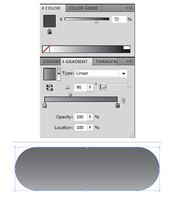
First make sure your object is still selected.Click on the gradient bar in the gradient panel to see our color stops.Right now we have two color stops a white and a black one because we still have a white to black gradient applied to the object.To add more color stops u can click on the bottom of the gradient bar and it will add a color stop where you clicked.so we can have more then two colors in a gradient.To get rid of a color stop you can just click and drag it off the panel.Click on one color stop and adjust its grayscale value(K value) up in the color panel. Do the same for the other stop to.I wanted a more subtil gradient so i went light gray to darker gray.Now lets adjust the angle because the gradient is going left to right but we want it to go from the bottom up. type in 90 into the angle area.Bring the adjustment diamond closer to the lighter color because we want that lighter color more on the bottom of the button. The diamond defines the point of transition between the two colors.Before I forget,you can also move the stops by clicking and draging them to the left or right.You can adjust from where that particular color starts to blend in with the other one.You can also adjust color stops by double clicking on them and you will get a color panel like pop up window,but since we have our color panel there it is the faster way I guess.The type of our gradient should obviously be linear. from the type you could choose linear or gradient.If you choose radial then your radial gradient roundness option becomes active.You can adjust how round or oval your radial gradient should look like.How to add color to gradients we will see when we create the ribbon that wraps around our button.But first lets add the shine to the top of the button.
First make sure your object is still selected.Click on it with the black arrow tool if not or just hit cmd/ctrl+A.that tells illustrator to select all objects on the artboard but we only have our button shape now.
Now go to Object/Path/Offset path.
In the dialog that pops up I will enter -2 points.This is my case scenario but for other projects you might want to check the preview box and experiment a little. Once you hit ok it will create an other shape that is slightly smaller in size.Now we have to go back to the gradient panel.If you have version CS5 you can choose from the presets fade to black by clicking that down pointing arrow marked in the image bellow.
It applies a gradient that goes from transparent to black.So first you will want to inverse the gradient by hitting the inverse gradient button(shown in the image about the gradient panel) then click the black stop and change its color to white in the color panel.You can use the adjustment diamond to adjust how far the shine will stretch into the button.
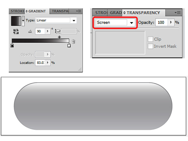
In case you have an earlier version you will have to use a black to white gradient and set its blend mode in the transparency panel to screen.So our newly created object still has the same gradient applied to it as the first one.You will want to go to the gradient panel click on each color stop and change they've color to white and the other to black.If black is on top of your button hit the reverse gradient button.In case you don't see the transparency panel,tho it should be next to the gradient panel then go to window /Transparency.Set the blend mode to screen,then go back to the gradient panel if needed to play with the adjustment diamond for a better look.Bellow you can see an image with the gradient panel,Transparency panel and the final result with the shine applied to the second shape.

Next it is time to create that ribbon looking thing.Go to View/Show Grid or use the shortcut Cmd/ctrl+" and View/Snap to Grid or its shortcut Shift+cmd/ctrl+".Now you should see a grid on your artboard.
We will use the grid as a guide when we create the shape and the snapping option to snap the anchor points we will create to points on the grid.To create the shape we will use the Pen tool.The pen tool allows us to virtually create any shape we want.You can use the shortcut"p" or choose the tool from the tool bar.
With the zoom tool(shortcut "Z") zoom in to the area you are planning to work on.

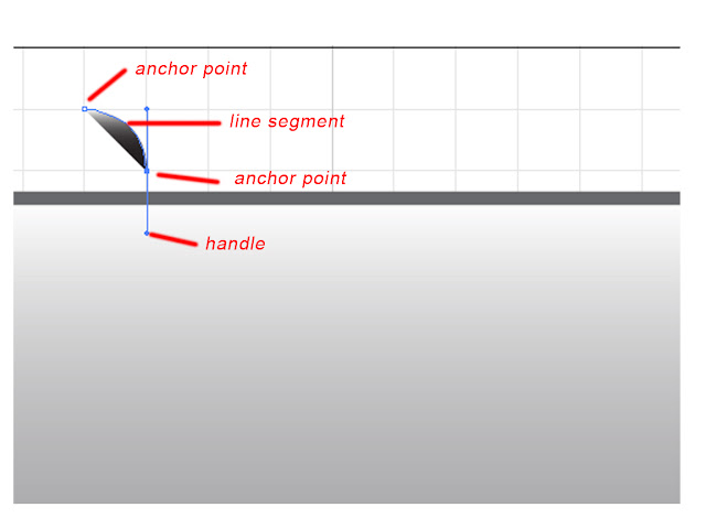
As seen in the image above,with the pen tool (shortcut "P") I placed an anchor point in the corner of a square(a click with the pen tool adds an anchor point).Diagonally in the opposite corner click and drag downward to create a curved line.Clicking without dragging would just create a straight line segment between the two anchor points.Dragging also creates two handles for that particular anchor point.These control the way the curve looks.One of them controls how the line "enters" the anchor point,the other one controls the way it "exits".As you can see in the image above I dragged in such way that the handles are equal with a side of a square.You shouldn't have problems to create this same curve as long as you have "snap to grid " turned on.Because of that second handle creating a third anchor will bend the line segment for you without having to drag.So in case you don't want that to happen you need to option/alt+click with the pen to make the second handle dissapear and you will end up with a straight line when creating the third anchor.If you want to readjust a curve you need to option/alt+click on one of the handles and drag them to your liking.That will readjust the curve.In my case however even tho i will want a straight line I don't need to option/alt+click the anchor point. If you look closely you can see that the line straightens out before it enters the anchor.So it will come out the same way.

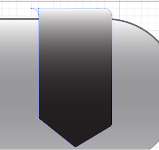
As you noticed in the image above I continued adding anchors to finish my shape.To create the other side of the fold I clicked and dragged to the left this time,and to close the shape I clicked on the first anchor I created.It is not perfect yet but with the help of the white arrow tool and the grid it will look better in no time.The white arrow lets us select and move anchor points.To select multiple anchors you will need to shift click each one of them or click and drag out an area of selection and it will select all anchors that fall inside of that area.You can find the white arrow in the tool bar under or next to the black arrow depending on how your tool bar is set up.After you select the anchors you can use the arrow keys on the keyboard to move them and they will snap to the grid making it easy to find the perfect position for them.
As you can see in the image above I fine tunned the shape using the white arrow.
It is time to add a colored gradient to our shape.As I guess you already noticed as we created the shape it already added a gradient to it.The last gradient you used,that means either the white to transparency gradient or the white to black gradient if you used the method with the blend mode change.To change the white to transparent gradient you could just go to the gradient panel and choose a gradient from there then go ahead and edit that further.You should not forget that you can add delete and position color stops to your liking.
But the again you could also use the eye dropper to copy the style of an already existing shape.
First zoom in so you can clearly see that 2 points that stick out from our first object that we created.We have a second shape above it that contains our shine.If you click that with the eye dropper you will copy its style to the ribbon.You have to make sure your ribbon is selected.Click on it with the black arrow. You can select the eye dropper from the tool bar,as seen in the image above or just use the shortcut "I".Than click on the visible portion of our bottom most shape and it applies the same gradient to our ribbon.
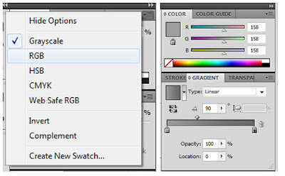
If you take a look at the color panel you can see that we can only change a so called "k" value for each color stop that only changes the grayscale value of that particular color stop.If you take a close look at your color panel you will see some horizontal lines and a small down pointing arrow in the upper right corner of the panel.If you click that you will be able to choose other color modes,because right now grayscale is selected.You will want to choose RBG from there because we are creating this for the web,and monitors work in RGB mode because they use light.First make sure you have a color stop selected in the gradient bar we will have to change mode for each color stop.

In the image above I changed mode for the first color stop the left color stop in the gradient bar.As it changes its mode to RGB the color stays the same and you can see in the color panel that we have an R=B=G=158 value for it.In RGB mode we can only have grays or black and white if R=G=B. R=G=B=0=black,R=G=B=255=white.The rest are shades of gray.Now if you play around with the sliders it will start adding color to the stop.The easiest way would be to choose a color from the color bar on the bottom of the color panel(where you see lots of colors going from red to red on the sides and white to black from the top to the bottom.It is the color wheels linear representation.
In HSB mode if you add numerically color values you want to add them in degrees.You have to imagine a wheel of color 0 degrees mean red so 180 degrees means it complementary color cyan).
Point being said you only have to click around to sample colors from that bar.After you are happy with your first stop click on the next one change its color mode to RGB then sample a color for it too.
This is my colored ribbon bellow.
Now lets create the back part of it.First hit Shitf+D to change the drawing mode from normal to draw behind.This will already draw our new object under all the already existing ones.
First make sure your ribbon IS NOT SELECTED any more. just cmd/ctrl+click on an empty portion of your artboard to deselect everything.Now with the pen tool("P") click on the same spot where you started the ribbon then go in the opposite direction and drag downward so that your handle rest on one side of the square and is equal in length.
Not deselecting your object would have caused the pen tool to delete that anchor point you have to click on to create the back side of the ribbon.Clicking on an already existing anchor with the pen will delete that anchor.It already ads the last gradient we used to our second shape,all you have to do now is go to the gradient panel,choose the darker color stop and in the color panel darken the G value of it by moving the slider to the left.
Things to do next!Right before we start forgetting that we are in draw behind mode lets reset that to draw normal by hitting two times shift+D,first time it will switch to draw inside mode the second time will switch to draw normal.Or you can just click the symbol and choose draw normal.We don't need the grid and the snapping option no more.Go to view/hide grid and view/snap to grid to uncheck that.Or hit cmd/ctrl+" and shift+cmd/ctrl+".
click and drag with the black arrow tool over the ribbon components to select both of them,without touching the button shape and shine.Tap the down arrow a few times to move both of them slightly downward if needed,well i found that it looks better if I move it down a little bit in my case.lets add a shine to the front part of the ribbon the same way we did with the button.select the front part with the black arrow tool,go to object/path/offset path and enter in a value of -2 and hit ok.then add a gradient the same way you did with the button.
A drop shadow applied to the front part of the ribbon would make it look a lot better.Here is the part where we learn a few thing about the layers panel.now that we are having a bunch of objects on top of each other the easier way to select individual objects would be the layers panel.
First in the layers panel hit that small down pointing arrow circled with red to show all objects on that layer.They will be named path1.path2 and so on.Double click those names and rename tath the same way that I did in the dialog that pops up.This will help us keep track of things.
The button shine has a circle that is not hallow because it is a visual clue we have some sort of effect applied to that object. i got stuck using the transparency panel method with that when I was showing you can do it that way to if needed.The ribbon shine has no effect because it is a gradient that goes white to transparent.We can use those circles to select objects from the layer panel the same way you would do with the black arrow tool.So we want to select the front ribbon to add a drop shadow to it.Click on the circle next to its name to select it.
We call this "meatballing".So we have meatballed the ribbon front.Now go to effect/stylize/drop shadow.
I went with the settings above for my shadow.It really is a matter of taste.X and Y offset controls the position of the shadow.The blur controls how washed out it will look.You can also change the opacity and bland mode of it.Check preview and experiment.
But we have a problem.If you look close enough you can see the shadow extends beyond the size of our button.We don't want that.
We need to add a clipping mask to it to fix this issue.By the way this drop shadow is re-editable because it is a virtual appearance. with the object selected you can go to the appearance panel(window/appearance if you don't see it) and you will find your objects stroke fill and other effects there.In our case the drop shadow.You can double click its name to edit it or drag the Fx to the trash can if you don't need it.To add a clipping mask we need to phisically create the shadow on the artboard.Go to Object/expand appearance(with the ribbon still selected.)This will create a separate shape out of the shadow and it will group it with the front ribbon.
In the layers panel a small arrow appears in front of the front ribbon shape.a visual clue that we have a group there.If you click the arrow you will see the two shapes the group contains.Thee ribbon and the shadow.However we don't need that group so meatball it and go to object/ungroup or hit shift+cmd/ctrl+G.we still are left with a group.The ribbon is a group of its own because the shadow is now ungrouped. so meatball the group again and hit shift+cmd/ctrl+G and that group dissapears to.
CLIPPING MASK STEPS
1.Meatball the button shape and hit cmd/ctrl+C to copy it.This is the shape we are going to use to create a clipping mask for the shadow.
2.Meatball Image which is the shadow object that I just forgat to rename and path is the ribbon front.I renamed those in the next step.Then hit cmd/ctrl+F or go to edit paste in front,and will paste an other button shape on top of our shadow object.the object on top will act as a mask for the object bellow so only the part that falls inside will be visible.
3.Meatball shadow and shift click on the circle of button to select them both at the same time and hit cmd/ctrl+7 and it will create a clipping mask.Or you can go to Object/clipping mask/Make to create a clipping mask.Once again the path on top acts as a mask for the path bellow that is selected.
Now all you have to do is add the text and some sort of symbol on the ribbon to have a stylish button.You can use the type tool(shortcut "t") click on the artboard and type in the text.To edit the size and color go to window/character.Once you are done with that with the black arrow tool you can position the text over the button by clicking and dragging it into place.
To create that two down pointing arrow heads I used the grid again and the snapping option.To scale objects select them with the black arrow tool then holding down shift drag from one of the bounding box corners.shift will insure that you are scaling proportionally.
I ain't going to do all these right now.I am confident by now you can do that on your own.I will jump to my already made button and show how to save it for the web.
Go to File/save for web and devices.In the preset roll down choose PNG-24.We are creating a 24 bit per pixel PNG file.I first tried PNG-8 but there was some banding in the gradients so 256 colors are not enough for this one.Why PNG? Because it can contain transparency for one,and we get good quality at a low file size.A JPG at the same file size would show some visible compression artefacts that would make our button look bad.And JPGs can't contain transparency.
Next go to image size.Make sure constrain proportions is checked.I just scaled down the size in percent to 40% of the original size.It looks like a good size for the button to me.You can also enter the size numerically if you have an idea how long and wide the button should be in the length and width fields.also make sure transparency is checked,then hit apply and ok.And there we have it! a button on a transparent background that you can use over any layout.


